Thoughts from Afield
 RSS Feed
|
0 Comments
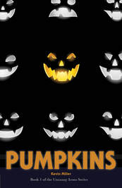
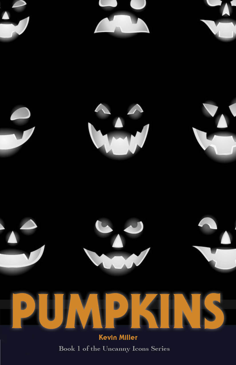
Pumpkins, book 1 in the Uncanny Icons Series, is now available in paperback and hardcover. You can also preorder the ebook at a discount, with the ebook releasing on June 28. I'm calling this a "light horror" series because it's spooky but not gory. Ideal for anyone ages 12-65+. Here's a brief synopsis. If they wouldn’t have planted those pumpkins, especially in that spot, maybe none of this would have happened . . . And here's a peek at the cover. 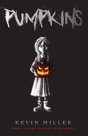 I love--and hate--working on book covers. I get very excited, and very anxious. I spent too much time yesterday toying with all sorts of ideas. Here's where I began. 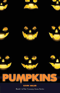 I liked it a lot, but I was told it felt too middle grade and not scary enough to be YA. I toyed around with different versions of this cover, as you'll see below.
But this just seemed to complicate things. So, I decided to simplify. Even though the book is called "Pumpkins," I decided to pare it down to just one. This is how it came out. 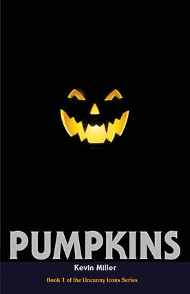 For font aficionados, the title font is from the original Halloween movie, and the series title font was used on a lot of old Stephen King novels. (Speaking of which, the font for the original cover is from the movie Scream.)
I really like this cover. It's simple and emotive, but after showing it to my kids--two of whom are in the YA market, they kiboshed it. They didn't feel it was scary enough or that it told enough of the story. They also felt it still skewed too young for my intended audience. Perhaps a scarier or different style pumpkin would help, but ultimately, I decided--woefully--to go in a completely different direction. However, I may still test a version of this at some point. I'll update you on that process as well. Right now I have an artist and a cover designer working on two separate versions of the same concept. I usually have a pretty clear idea of how I want the covers for my books to look. The same goes for interior illustrations and comic book panels. The problem is communicating my ideas to the artist I'm working with. Considering my limited artistic skills, that's always a significant challenge. Right now I'm in the midst of writing book 1 in the Uncanny Icons series, which I'm developing for YA (young adult) readers. Each book in the series is based around a different Halloween icon, the kind you see in windows and in classroom walls around that time of year. For example, book 1 is called Pumpkins, book 2 is called Brooms (it'll be about witches), book 3 is called Fangs (vampires), and so on. I'm in the midst of writing Pumpkins right now (nearly halfway through my first draft). I'm very excited about how things are going, so I thought it was time to bring in a cover artist to help usher the book into reality. For this book (and hopefully this entire series) I'm partnering once again with Hannah Doerksen, who did such a great job on illustrating Randolph the Yellow Snowman. I tried to describe what I was looking for in a cover, but when Hannah's first draft came through, I realized I hadn't done a very good job of communicating. So, yesterday I took pen in hand and produced the following. 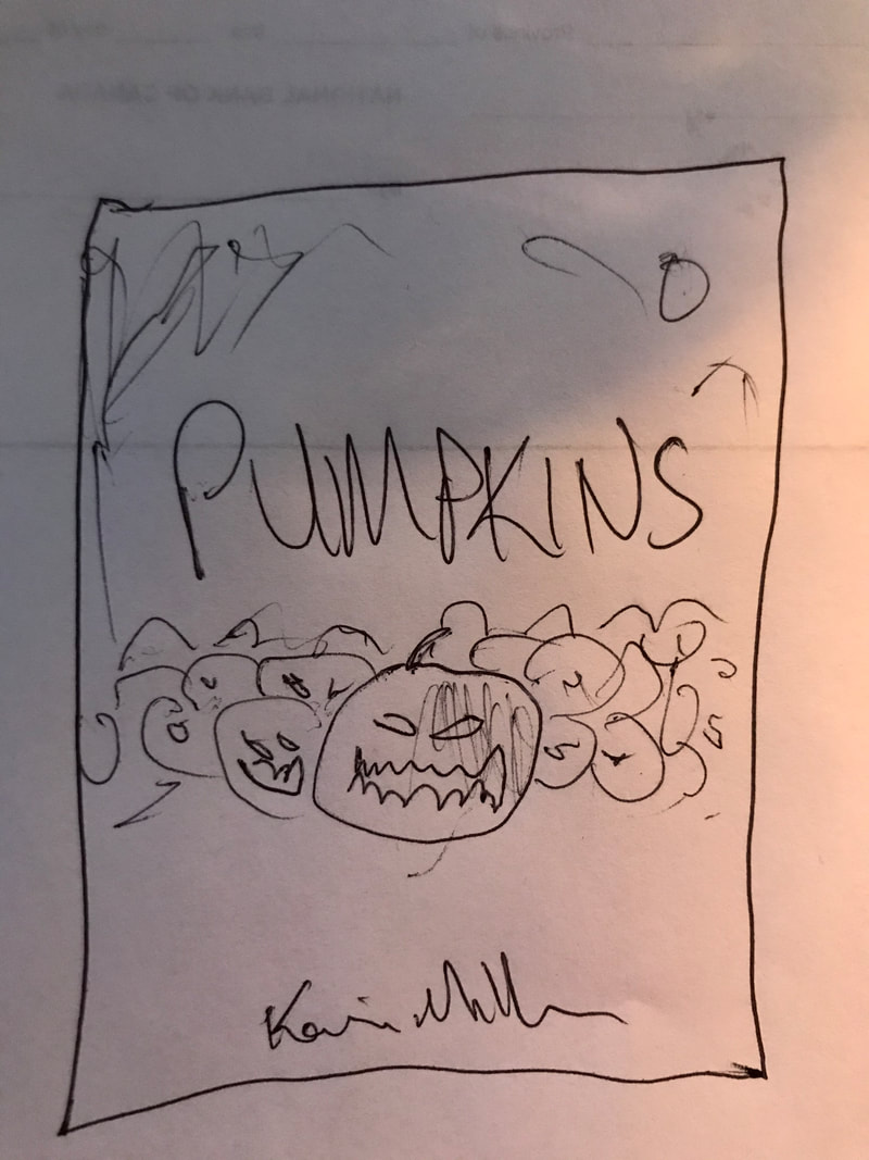 I realize it's not brilliant, but I was actually surprised at how closely I managed to replicate what I was seeing in my mind (minus a few details, which I communicated to Hannah in writing). We'll see if this helps the process along.
Creating covers is always a stressful process for me, but it's always exciting when things finally come together. I'll post subsequent drafts as they come in. |
Kevin MillerBrief thoughts and updates on writing, publishing, and life Archives
February 2024
Categories
All
|